Wait. Is that a plastic chair?
No, it can’t be a chair, there’s no place to sit.
What’s with the fur ball?
That’s not a fur ball.
So what is it?
A sample.
How is that a sample, it looks like Bigfoot eating cotton candy?
Well, that’s what a sample looks like.
That’s insane…but also totally amazing.
Yup. Welcome to Playbox by Native Instruments.
Playbox is a Kontakt instrument that has stunned the music production crowd with an interface all its own. The visual language was so different we were compelled to uncover the genesis of this amazing interface and interviewed the developers, Nadine Raihani, Mickael Le Goff, and Antonio de Spirt, to learn more about its development (full interview below). Turns out that Playbox began as a side project by Raihani who felt her own music production was stagnating and wanted to create an instrument that would kickstart her creativity. What’s fascinating is that Raihani performs Product UX and Market Research at Native, not product design. Yet, this proved to be a huge advantage, allowing her to think outside of the box, and bring a fresh and truly unique perspective to the plug-in arena.

For a limited time only! Up to 80% off all Waves Bundles. PLUS click the banner above or the Go button for an additional 10%! This is Waves best deal yet! Get yours today before this special ends! Go!
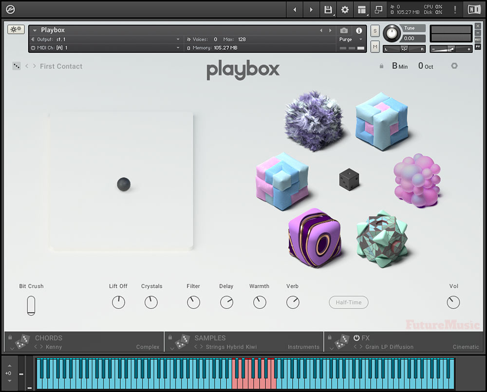
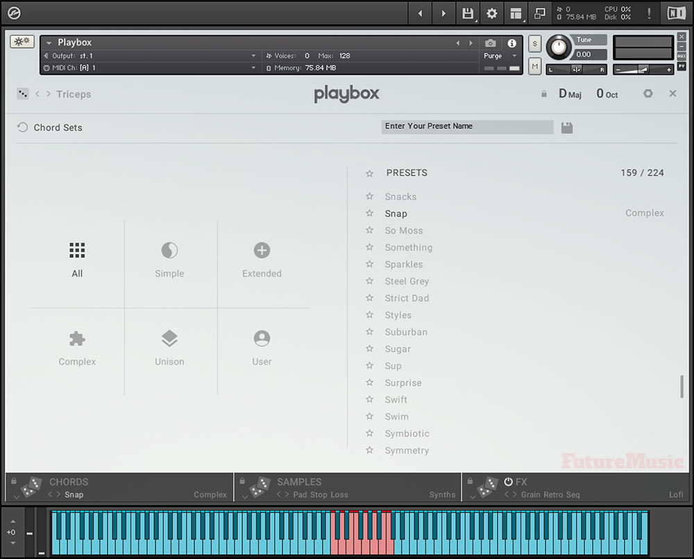
Playbox’s Main Page
We subjected Playbox to a long-term review and our evaluators found the whimsical interface not only fun, but inspiring. (Our reviewers personal comments are in quotes). When you first launch Playbox, it’s hard to determine what exactly is going on. You are greeted with a light gray background, a large X/Y pad on the left and a bunch of pastel-colored objects on the right. These “intriguing doodads” are made up of plastic, fur, sprinkles, pieces of candy, bubbles, graph paper, origami, art deco furniture, gems, and other elements you may not be able to decipher. It doesn’t matter. “No matter how many times I hit the random button, I was delighted to see what types of objects stuck in gum emerged,” revealed one evaluator. Along the bottom, going from left to right, there is an Arpeggiator percentage slider that dictates the octave range and two attributes that pertain to the X/Y slider, which change with every patch. The next four “knobs” are almost like macros that affect the major features of each patch. Finally, a lone volume knob sits in the bottom right corner.
The Whimsical Interface Is Not Only Fun, But Inspiring
The top of the interface is where you can choose one of the patches, “although the names generally don’t necessarily refer to the sound,” the key, the octave range (-2 to +2) and the chord settings. Sprinkled throughout Playbox you’ll find two very important icons, the Lock and the Dice. The Dice (sometimes just a single Die) indicate a feature you can randomize. The Lock allows you to secure an attribute so it won’t change when you modify or randomize another facet of the interface. This comes in quite handy because using the dice can cause a serious change in areas of Playbox you don’t fundamentally want to alter, such as the key. For example, each preset in Playbox is set to its own key, but if you’re working in Amin, you certainly don’t want to listen to presets in Bmaj, so you can click the Lock button and the key won’t change. “Sometimes the little Lock icons are hard to see, but you’ll want to take advantage of them to keep things on the Yellow Brick Road,” one reviewer advised.
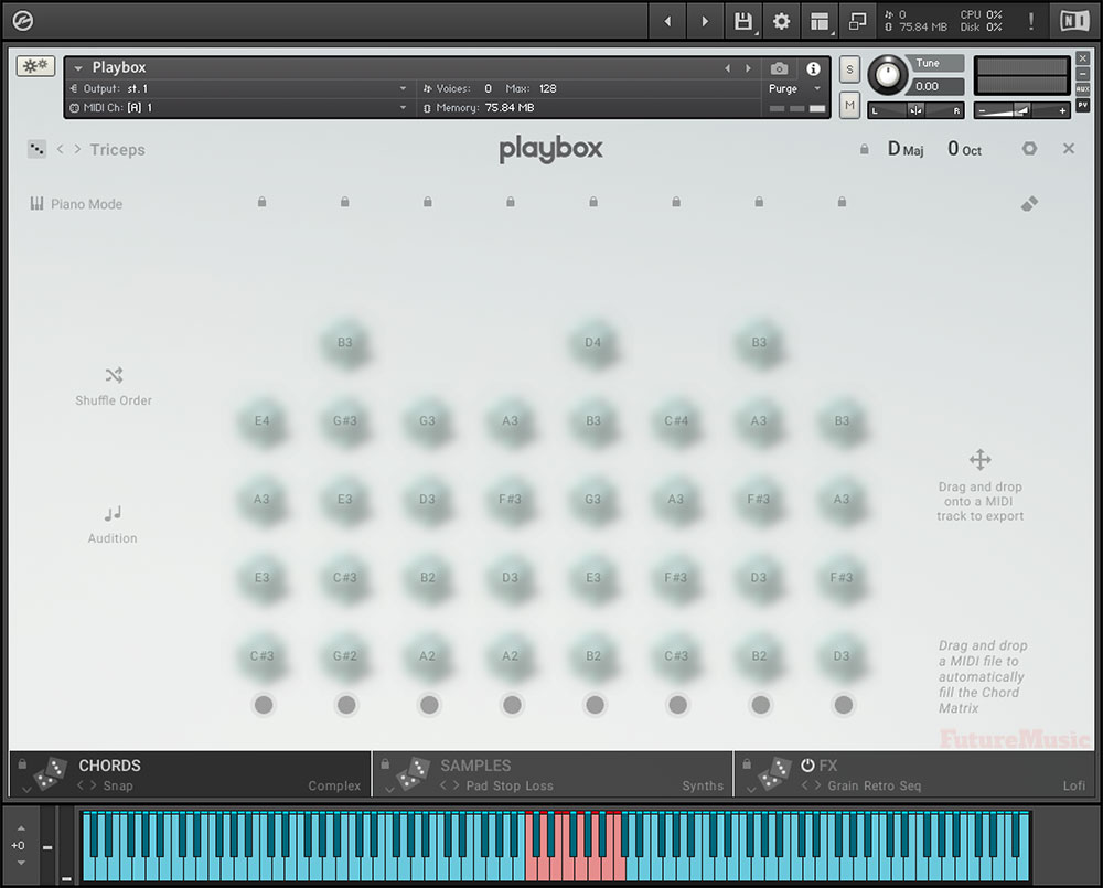
The Chords Page in Playbox
The dark gray band along the bottom is divided into three boxes, Chords, Samples and Effects. Clicking Chords will bring up a new grid interface with blurred-out blobs in eight columns. Each column is a chord and each dollop is a note and its corresponding sample. Why are the samples are blurred-out? Because you can’t change the individual samples here, only the notes. Lock icons appear at the top of each column to fasten them down in case you want to use the Shuffle button to change the order. If you want to add your own chords, simply push the gray circle on the bottom of a column, which turns red, allowing you to input each note individually, up to six. Click the circle when you’re done to stop recording.
Playbox has many chord presets that can be scrolled through via the gray box, or you can use the dice to mix things up. When you have something you like, simply drag and drop the chords into your DAW. You can even import a MIDI file into Playbox, if you’ve come up with a nice progression on your own, but want to utilize Playbox’s samples and effects.
Almost 1000 Samples To Choose From — Or Import Your Own!
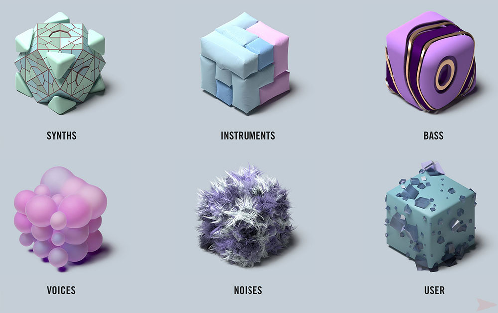
Just to the right of Chords is the Samples page. Same grid interface, but here you’ll see that the nubbins are no longer blurred and there are dice and lock buttons everywhere. The five different sample categories appear on the X-Axis, Voice, Instruments, Synths, Bass, Noise and User, to showcase how the preset is structured. Each category has its own visual metaphor, such as Bubbles for Voice and Fur for Noise. There are about 1000 samples included with Playbox and each one has its own visual fingerprint. Sometimes the differences between samples is very subtle. For instance, some of the plastic cushions are more inflated, but each one has its own unique identity. “What’s amazing is the ability to import your own samples,” revealed one of our evaluators who has an extensive sample collection. “This allows you to take full advantage of field recordings or sample libraries you’ve accumulated over time and bring them into the Playbox environment.”
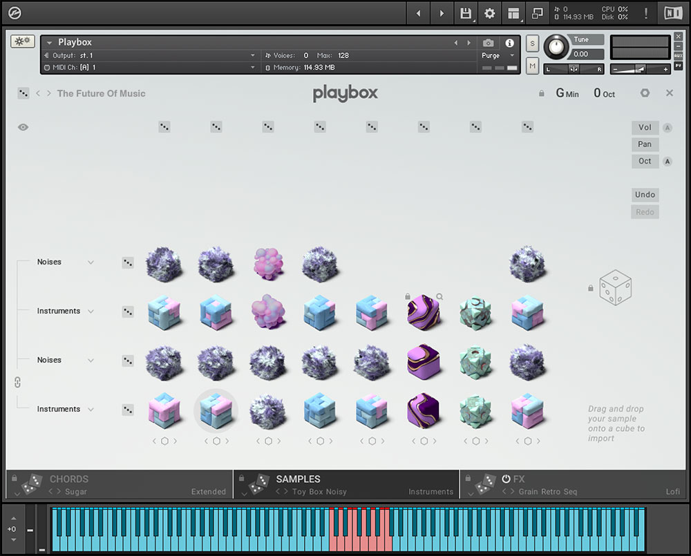
Playbox’s Samples page

It’s exhilarating to think that Playbox emerged from the mind of Nadine Raihani simply as a vehicle to stimulate her own musical adventures….
Finally, we come to the Effects section. “Now this is where the magic occurs.” Like the Chords and Samples, the Effects section has presets, as well as the Dice to randomly select a preset. Now you can achieve satisfactory results with just the presets, but “this isn’t where the real action is” and “getting under the hood of the Effects section is where you’ll be spending the majority of your time.” We can’t stress how “absolutely brilliant” the Effects section is in Playbox and what Native Instruments has achieved here. “It’s just phenomenal.”
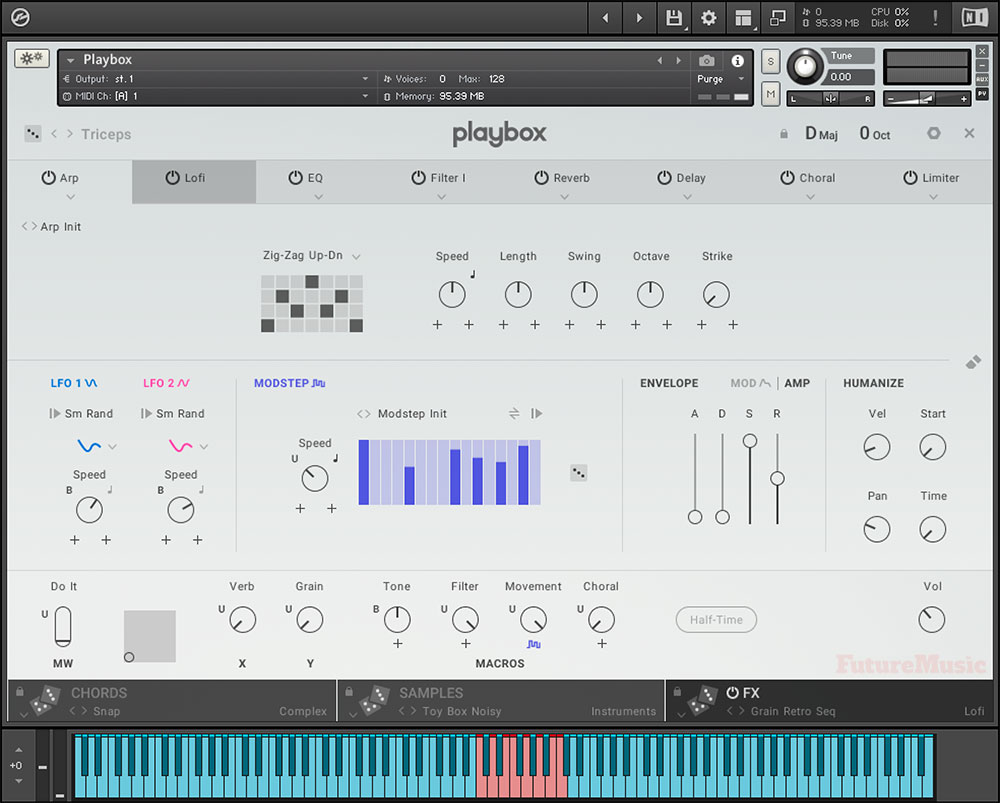
Playbox’s FX page with the Arp’s Zig-Zag Up/Down motion effect
Playbox’s FX page starts off with a preset’s Effects Chain. Using tabs, it showcases the signal flow moving from left to right. You can change the order of the effects simply by dragging a tab to a new location. Each one of the effects controls is simply laid out, but there is more depth than meets the eye. There is a lot to unpack in the effects section, but let’s begin with “one of the stars of the show,” the Motion effects: Arp, Strum and Grain. Nadine Raihani and her team developed some “truly novel” concepts that you won’t encounter in other sample players. The Arp’s Pattern Selector provides ten different movements laid out on a 4 x 7 grid. You have your classic up, down, up/down, and down/up, but you also have Zig-Zagging movements. It certainly opened the minds of our reviewers who were enthralled by the visual depiction, but they also came away a little disappointed that they couldn’t create their own grid patterns. Other attributes include Speed, the rate of playback, and Sync, to match the tempo of your DAW, as well as Length, to adjust the duration of the individual notes, and Octave range. Playbox also includes two added features not normally witnessed in Arpeggiators, Swing and Strike. Swing provides a shuffle feel to the sequence’s rhythm and Strike modifies the number of consecutive repetitions of each note in the sequence.
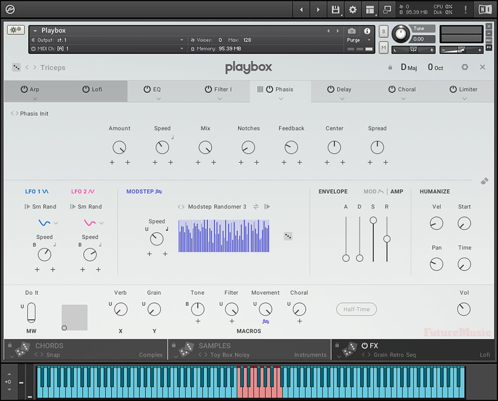
Phasis is Playbox’s take on the tradition Phaser effect with some new twists
Imaginative Results
Strum is set up like an arpeggiator, but only plays the notes of the chord once, as if being strummed on a guitar. It also allows for “some imaginative results with some of the the more esoteric samples.” Grain is an entirely new methodology for adding spice to your chord progressions and is modeled after granular synthesis. Using MIDI data, Grain takes each sample and divides it up into small chunks of sound. You can then modulate the data to create rich textures and rhythms via several controls including Size, Speed, Start, Shape, Velocity, Pan, Pitch and more. “Grain acts like a particle beamer and can fundamentally change a sample’s DNA.”
Users then have fifteen different effects to apply, including LoFi, Delay, Reverb, Choral, Flair, Phasis, two different Filters, EQ, Punch, Compressor, Limiter, Tape, Charge and Stereo. The Delay comes courtesy of Replika’s algorithms and is pretty straight forward, as is the EQ, Reverb, and Choral, a fancy name for 1980’s modeled chorus effects — think Midiverb. There’s a dedicated LoFi effect, which is all the rage right now, and “does a commendable job,” but our reviewers felt more “wow and flutter” was needed. Flair is a much needed modern update to the well-heeled Flanger effect with “excellent results.” Flair also includes a sophisticated Dampening feature. “Even when things are going Flanger Nutty, using the Dampening feature can round off the corners,” so you still get the effect, but “in more refined manner.”
Playbox Specifications:
- Komplete Instrument
- Free Kontakt Player version 6.7 and higher, or Kontakt version 6.7 and higher
- Number of sounds: 1301 presets, 905 samples
- Download size: 1.2 GB
- System requirements: Free Kontakt Player version 6.7 and higher, or Kontakt version 6.7 and higher.
Phasis is another rework of the bread ‘n’ butter phaser effect, but with added controls and a new way of approaching the filter’s modulating movement. Phasing is created by modulating the filter’s peaks and notches over time, and Phasis provides dedicated control over the number of peaks and notches, as well as their proximity to each other in the frequency spectrum. The outcome is an entirely new effect and one that our reviewers enjoyed inserting it in unexpected places, such as after Reverb to create discreet drifts and animation.
Tape can provide some of the saturation and compression inherent in decks, but can also be overdriven to create distortion. Charge is NI’s take on tube compression with a “softness” and “full-bodied” signature that works well on some of the more biting samples to “reduce sharpness.” Punch is a transient designer for control of the attack and sustain of incoming percussive signals, such as drums and hard-hitting pianos. Stereo offers the ability to widen or narrow the soundstage and add faux dual-channel spread to mono signals.
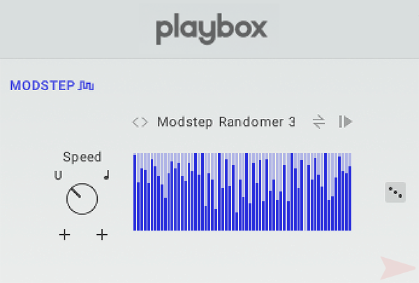
Sitting below the effects pane are the Modulators. Again, “Native Instruments didn’t fax this in.” How you can apply these to the effects is “stimulating” and “almost too fun.” The Modulators include Modstep, Amp Envelope, Mod Envelope, Humanize and two LFO’s, and can be assigned to certain effect parameters to add animation and movement. They are “super easy to use” and “prompt experimentation” by “employing them in areas you may never have thought of previously.”
All the Modulators are “amazing” and provide “slow dancing to mosh pit mayhem,” but Modstep seemed to be our reviewers’ favorite. It’s a special sequencer that can run on its own or be tempo sync’d to create “mind-blowing motion.” Here you can get your hands dirty by drawing your own sequences and shapes in the editor by right-clicking Windows or control-clicking on the Mac.

The easiest way for electronic musicians to get their music onto Spotify, Apple Music, iTunes, Amazon Music, Tidal, Instagram, Facebook, TikTok, Pandora, Twitch & much more! Click the banner above or the Go Button to save 7% off of your signup! Go!
There’s a lot going on with Playbox besides the pretty interface
As you can see, there’s a lot going on with Playbox besides the pretty interface. And this is what makes Playbox truly special. Nadine Raihani, Mickael Le Goff, and Antonio de Spirt were able to marry a truly brilliant interface with “absolutely incredible audio quality.” The samples that come with Playbox are “varied, provocative, dynamic and very musical.” But Native Instruments then adds “astonishing effects and processing” to “take even the most mundane sample into new realms.”
For those of you who may be intimidated by musical theory and chord progressions, we have yet to encounter a friendlier biosphere than Playbox. “It’s so much fun to use, that you’ll forgive yourself from quitting piano lessons when you were 9 years-old.” Considering all the artificial intelligence driven products that have emerged recently to assist in music composition, nothing touches Playbox’s “entertaining, yet elegant environment.”
Conclusion
Playbox certainly lives up to its name and is “a sandbox filled with your favorite toys” to play and experiment. It’s exhilarating to think that Playbox emerged from the mind of Nadine Raihani simply as a vehicle to stimulate her own musical adventures. In an industry dominated by male developers, it took a woman to deliver one of the best plug-ins we’ve tested in quite some time. In fact, we can’t say enough good things about Playbox. We also have to salute Native Instruments for being open enough to entertain a product concept that was created outside their usual production process and by an employee who wasn’t directly involved with product development. For a company that got rolled up with iZotope, Plugin Alliance and Brainworx by a private equity concern, it could have easily dismissed this excursion into the unknown. Good thing for us, Raihani’s brilliance preserved. “It’s the gift that keeps on giving.” Highly recommended.
Native Instruments Playbox Rating: 100%
Cheers:
+ Sound Quality
+ Innovative
+ Enormous Fun
+ Visual Language
+ Complex, Yet Simple
+ Phenomenal Effects
+ Import Your Own Samples
+ Chord Implementation
+ Musical Theory Not Required
+ Manual
Jeers:
– None
Playbox by Native Instruments retails for $199.99 and is available now.
The Future: We’d love for NI to expand upon the Arpeggiator grid and allow further user interaction. A new “sandbox” page that allows you to construct layered samples by simply dragging and dropping materials, fur, bubbles, plastic, etc. onto a blank canvas may be a fun addition.

Interview: Nadine Raihani, Mickael Le Goff and Antonio de Spirt
FutureMusic: Can you please tell us about your backgrounds in design and how you came to Native Instruments?
Nadine: I studied Audio Engineering at the SAE Institute in Berlin after moving here from Bristol. I was writing my thesis on granular synthesis and randomly met Mike Daliot, who created Massive. That meeting led to my internship in the Sound Design Department at NI in 2006. When that ended, I started working for the company full-time across different roles. Now I lead the UX & Market Research team in the Product Design Department. Before working on the concept for Playbox I didn’t have a lot of practical experience in UX Design other than patching my own modular synths in Reaktor as a hobby and some basic scripting in Kontakt.
Mickael: After studying digital signal processing at the IRCAM in Paris, I joined the research team of Native Instruments in 2009. For over ten years, I developed new audio effects, sound synthesis and music analysis tools that were integrated in close collaboration with the UX designers into Kontakt, Guitar Rig, Maschine and Traktor. I learned a lot about music software creation during those years, from the low-level to the user-facing components.
On the visual side, I’ve always been passionate about experimental filmmaking. While it started out as a hobby, I pushed it further over the years and produced several music videos with Robot Koch, as well as a fully immersive audio-visual show titled “Sphere”, which was designed for planetariums. Now, I work solely on a freelance basis and bring together my interest in music software, UI, UX and visuals.
Antonio: In 2006, I played at a party in Berlin and met one of the former NI Marketing Team members who happened to be there that night. A few days later, he sent me a copy of Komplete 4 and, in return, he asked me for some audio demos for Kore 2 and Massive. That really motivated me to step up my music production; before that, I was just messing around with some random software. After that, I worked on several projects with NI as a freelancer, doing presets and demo songs. When I finished my studies in Media Technology in 2012, I joined Native as an intern and have been working there ever since.
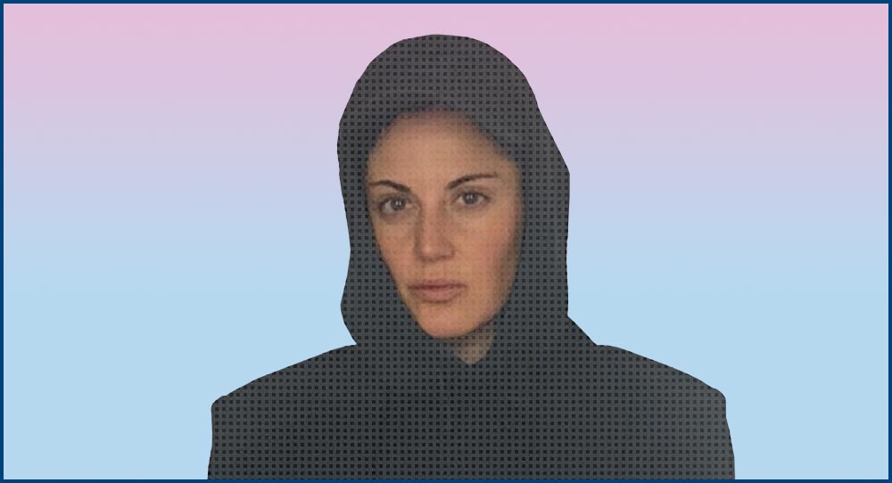
Nadine Raihani
FutureMusic: What artists, both visually and sonically, inspire you?
Nadine: As a group, we agreed that sonically we wanted the sound library to be genre agnostic so that each time you roll the dice, you could have a completely different sound aesthetic. I’ve always loved layering sounds in unusual ways and combining that with harmony, so I like a lot of music that takes a similar approach. Visually, we had a good idea of which style we wanted to go with from the beginning and created a mood board of work from artists we felt captured that visual identity. There were many, but Vincent Schwenk was definitely a stand-out.
FutureMusic: What excites / motivates you the most about the possibilities of audio production software?
Nadine: I’ve always been excited by audio software that inspires and surprises me. I love randomization and layering, but layering can also be a very time-consuming and boring task. Plugins that remove the tedious and repetitive parts of the music-making process resonate with me a lot.
FutureMusic: Can you discuss the genesis of Playbox? It has such a provocative design, I’m wondering if the graphic interface came first, or the audio, or where they developed in tandem?
Nadine: Playbox started in mid-2019. Around that time, I felt bored with my own music production and created a concept for an instrument I hoped would get me out of my creative block. It was my first time conceptualizing and designing an instrument. In my day job at NI, I wasn’t a product designer, so Playbox was something I did as a hobby outside of work in the evenings and on the weekends. After showing a prototype to my friends Mickael Le Goff (Playbox visual designer and developer) and Antonio De Spirt (Playbox sound designer), we went down the rabbit hole together, refining Playbox and making sounds for the library. Playbox was a perfect project amid the pandemic lockdowns. Our colleagues at NI really liked what we ended up with and inquired about releasing it, so in the final phase of the process, we collaborated on the final details with the NI designers and marketing team, which was awesome. Mickael was our main GUI designer and worked closely with the designers from NI to create the Playbox design.
Regarding what came first, the audio or the interface: First, we curated a collection of samples to use as references for the sound aesthetic we were looking to create. We used this library for the first six months while making the first prototypes of Playbox. By the time we started recording the samples for the final library, we had a good feeling about which sounds worked well and where we wanted to take things. It was the same process for finding the right chords for the Chord Library – just a lot of experimentation and refining.
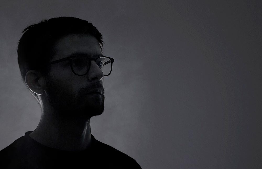
Mickael Le Goff
FutureMusic: How did the materials emerge? From the thick hair to the embedded glass fragments to the plastic cushions, there is certainly a lot going on as far as textures!
Nadine: Mickael, Antonio and I had a mood board of work from visual artists we loved from the very beginning. I remember Vincent Schwenk was one of the designers who inspired us, but the mood board was quite extensive and pulled from a lot of different sources of inspiration. The plastic cushions and bouncy castle were Mickael’s invention and it’s my personal favorite of all the cubes, next to the furry ones.
FutureMusic: The pastel color palette is a wonderful choice…however, with all the color choices that must have been available, how did you settle on pastels?
Nadine: We felt from the start that this aesthetic was what we wanted for Playbox. It just seemed to fit the rest of the concept for the instrument by encapsulating the playful approach.
FutureMusic: Each type of sound is depicted by a different shape/texture – are the choices purely aesthetic / experimental? Or is there a motivation behind each?
Nadine: The Sound categories in Playbox are Voice, Instruments, Synths, Bass and Noise. The furry shapes for Noise and the pink bubbles for voice were easy choices; we felt they personified the sound really well. The other shapes came later in the process. For us, it was important that the user could somehow feel the sound aesthetic just by looking at the shape.

Mickael Le Goff
FutureMusic: Take us under the hood as far as the sounds are concerned. How were these developed? What was your criteria conceptually? Ultimately, what types of sound were included or rejected?
Nadine: The sound design involved a few different parts: recording/editing of the samples, creating the chord progressions, creating the sample sets and effects presets and then finally, the global presets. This is a lot more than most instruments, so we started the sound design very early. Before we started recording, I had spent around six months experimenting with sounds, just listening to the way the harmonies would sound with a different sample on each note of a chord. We didn’t have any references really. As far as I know, Playbox is the first instrument to use this technique and as a result, we went through a lot of trial and error. Some sounds I thought would work didn’t and then some I thought were duds, but tried anyway, completely surprised me and sounded magical.
After around six months of experimentation, we had a pretty good idea of the sound aesthetic we wanted to go for and started creating our library. I remember the first recording session was in my friend Peaches’ and Black Cracker’s studio, where I recorded a wonderful Opera singer called Mireille Lebel. We recorded around ten vocalists for Playbox and it was one of my personal highlights. We were also lucky to record with two wonderful string players. The rest of the instruments we played and sampled ourselves. Generally the more obscure the instrument the better – but no phrases, only single notes.
FutureMusic: How did the visuals evolve?
Mickael: Since the early days of development, we had a strong motivation to attach the playfulness of the instrument to the user interface. The interactions and animations had to be linked in a meaningful way so we created a visual world that would highlight the samples. We designed a set of shapes to illustrate the sample categories with some abstraction. The voice represented by smooth shapes, wobbly ones for the bass, a sci-fi vibe for the synths and so on. These were created in a generative way which allowed us to easily render hundreds of variations, one for each sample. In other words, we programmed several 3D generators and changed their parameters in random ways to realize a similar output. With all combined, you create your sound textures with a unique visual palette.
FutureMusic: The graphical elements seem to modulate slightly when changing parameters. It can be quite subtle, but interesting to see their transformation. What is the thinking behind these changes? And what do you want the user to understand sonically from these changes?
Nadine: There are around 1000 samples in the library and we wanted each sample to have its own dedicated shape beyond the category it belongs to, even if it’s just a subtle change. This partly creates the modulation you’re speaking about, because each chord can have a unique set of samples.
Mickael: The main page represents the number of samples and their categories when playing a particular chord. If you use the “spread” option on a chord, playing any of the chords would lead to a static animation. We added a slight movement in the objects to add liveliness while playing different chords in this mode.


